Pick up a business card that’s been printed on thick, uncoated stock with a soft matte finish. Now pick up one that’s been printed on the thinnest, glossiest paper the printer had available. Before you read a single word on either one, you’ve already formed an impression of the business that sent it.
This isn’t a quirk of human psychology — it’s a well-documented phenomenon. The physical properties of a printed piece communicate information about a brand independently of the words and images on it. Weight signals substance. Texture signals craftsmanship. Finish signals intention. A brand that chooses its print materials thoughtfully is speaking through the paper itself, and most of the time, the person holding it doesn’t even consciously register that it’s happening.
For businesses in Greenfield and across the Indianapolis area that invest in print marketing, understanding this dimension of how print works can meaningfully change the return on that investment. Here’s what’s actually being communicated — and how to make it work for your brand.
Weight: The First Thing People Notice Without Noticing
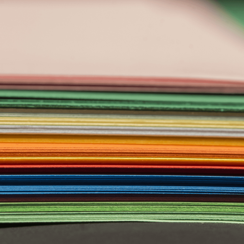
Paper weight is measured in pounds in the US — the higher the number, the heavier and more substantial the sheet. Standard copy paper is typically 20 lb. Business cards and postcards are usually printed on 14 to 16 pt card stock. Premium business cards go up from there, with some reaching 32 pt or higher.
The reason weight matters so much in the hand is that our brains associate physical heaviness with quality and reliability. It’s not a logical connection — a heavier piece of paper doesn’t actually perform better at communicating information — but it’s a deeply ingrained one. Studies on what researchers call “haptic feedback” in marketing consistently show that people rate products and brands more favorably when they’re associated with heavier physical materials.
For a business card especially, weight is one of the easiest ways to make an immediate impression before the person has read your name. A card that has presence in the hand — one that doesn’t bend when you hold a corner of it, that has some actual mass to it — communicates confidence. A flimsy card communicates the opposite, regardless of how good the design is.
Finish: What the Surface Says About the Brand
Gloss, matte, soft-touch, satin, uncoated — the finish of a printed piece is one of the most expressive variables available in print production, and also one of the most commonly defaulted rather than chosen.
Gloss finish is reflective and vivid — colors pop, images look sharp, and the piece has an immediate visual energy. It reads as bold, modern, and high-contrast. It’s a natural fit for brands that want to project confidence and immediacy — retail promotions, event materials, product-focused brochures. The limitation is that glossy surfaces can feel slightly cold to the touch and can create glare under certain lighting conditions.
Matte finish absorbs light rather than reflecting it, which gives printed pieces a quieter, more refined quality. Colors are slightly less saturated than on gloss, but the trade-off is a surface that feels premium and intentional in a way that gloss sometimes doesn’t. Matte is almost always the right call for brands in the professional services space — law firms, financial advisors, architects, consultants — where the brand needs to communicate trustworthiness and sophistication rather than excitement.
Soft-touch laminate takes matte a step further. It’s a coating that gives the surface a velvety, almost fabric-like feel that’s immediately distinctive. Picking up a soft-touch business card or brochure feels like nothing else in print, and that tactile distinctiveness translates directly into memorability. If your goal is to hand someone something they won’t forget — or won’t throw away — soft-touch is one of the most effective tools in print finishing.
Special Finishes: When Print Becomes an Experience
Beyond the standard laminate options, there’s a range of specialty finishes that take the tactile dimension of print into genuinely memorable territory. These aren’t right for every piece or every budget, but for the right application they’re extraordinarily effective.
Spot UV is a technique where a glossy coating is applied to specific areas of a matte piece — a logo, a headline, an image — creating a contrast between the reflective and non-reflective surfaces that’s both visual and tactile. Running a finger over a spot UV logo is a distinct physical experience, and one that tends to make a piece feel significantly more premium than the sum of its parts.
Foil stamping — applying a metallic or pigmented foil to specific elements — adds a visual dimension that’s impossible to replicate digitally. Gold foil on a dark card stock carries a weight of formality and prestige that no ink color can match. It’s not appropriate for every brand, but for a real estate agency, a financial services firm, or a luxury product brand, it communicates something that plain printing simply can’t.
Embossing and debossing — pressing a design into the paper to create a raised or recessed impression — are among the most purely tactile effects available in print. An embossed logo on a business card or letterhead invites the recipient to touch it, which extends the time they spend physically engaging with your brand. That extra moment of engagement is worth more than it might seem.
Uncoated Stock: The Case for Not Going Glossy
There’s a growing appreciation in print design for uncoated paper stock — paper without any laminate or coating applied, which gives it a natural, slightly textured surface that’s very different from either gloss or matte laminated stock.
Uncoated stock has a warmth and approachability that coated papers sometimes lack. It feels more like stationery, more personal, more handmade — which makes it a natural fit for brands that want to emphasize authenticity, craft, or community connection. Local restaurants, independent retailers, creative businesses, and nonprofits often find that uncoated stock aligns better with how they want to be perceived than the corporate slickness of a high-gloss finish.
It’s also worth noting that uncoated paper accepts writing more readily than coated stock — which matters if you’re producing something like an appointment card, a notepad, or any piece that the recipient might need to write on. Form following function is always good design thinking.
How to Match Your Materials to Your Brand
The question to ask when choosing print materials isn’t “what looks good” — it’s “what feels like us.” A law firm and a food truck can both produce beautiful printed pieces, but the materials that serve one would feel completely wrong for the other. The law firm’s business card probably wants to be heavy, matte, restrained. The food truck’s menu board probably wants to be bold, bright, energetic.
If you’ve never had this conversation with your print partner, it’s worth having. A good printer doesn’t just execute files — they can walk you through the material options available and help you understand what each choice communicates. The difference between making an intentional choice and defaulting to whatever the standard option is can be significant, and it doesn’t always cost more to choose deliberately.
At Davant, these conversations are part of how we work. We want your printed materials to feel like your brand — not just look like it. Because the people receiving them are experiencing both, whether they realize it or not.
Let’s Talk About What Your Print Materials Should Feel Like
The businesses that understand this have a subtle advantage over the ones that don’t — and it shows up every single time someone picks up their card, opens their mailer, or walks away from a meeting with something in their hand. It’s not a dramatic advantage. Nobody’s going to consciously think “wow, that paper stock really moved me.” But the impression accumulates. The weight of a well-made card, the quiet luxury of a soft-touch finish, the unexpected pleasure of a spot UV logo under the light — these things register below the surface, and they shape how people feel about a brand in ways that outlast the moment of contact.
That’s the real argument for thinking deliberately about your print materials. Not that any single choice is going to transform your business, but that the cumulative effect of intentional decisions — made consistently, across every piece that leaves your office — builds a brand that feels as good as it looks. In a market where most businesses are making default choices, that consistency is genuinely distinctive.
We work with businesses throughout Greenfield and the greater Indianapolis area to make those choices intentional — from paper weight and finish to the finishing details that make a piece worth keeping. If you’re ready to think about your print materials as more than just a vehicle for information, we’d love to be part of that process.
Contact us online or give us a call at (317) 849-6565 to get started.