You may have wondered why it feels serene when you’re surrounded by green fields, blue skies, and white clouds. Do you ever notice that certain places upset you more than others? Or that certain locations are particularly soothing and relaxing? There’s a good likelihood that the colors in those areas contribute to your personal preferences. There are many different ways that color affects our psyches. It’s called color psychology.
What is Color Psychology?
Color psychology is the study of the relationship between colors and human behavior. It is a branch of color theory that assigns emotional and psychological implications to colors and feelings. Many of these have universal meanings because they affect the brain, but others are culturally specific and vary from people’s color preferences.
Why Does Color Psychology Matter?
The psychology of color can influence people’s emotions and perceptions in daily life. For example, with color psychology, color combinations and color palettes from the color wheel are widely applied to entice people to eat, associate a positive or negative tone, inspire trust, emotions of peace or vigor, and a variety of other purposes. That’s why it’s no wonder why many people, such as marketing and branding experts, use color psychology to create effective marketing campaigns.
Color Psychology improves marketing and advertising efforts.
Knowing color psychology gives your business a competitive advantage. Whether you’re picking colors for a product or service, color psychology in marketing significantly impacts how people perceive brands. Therefore, understanding the psychological and personality effects of various color combinations, including diverse shades and tints popular with manufacturers and consumers, is vital to your marketing.
Color Psychology communicates your brand value.
Color is unrivaled in terms of communication. The fact that most cleaning products are packaged in white is usually for a good reason. It’s also why most fast-food businesses utilize red and yellow as their primary colors. It’s called color psychology, and it works by using our subconscious associations with certain hues to express the qualities of a product.
While color theory impressions are relatively subjective, some effects have universal significance. Warm colors like red, yellow, and orange can evoke a wide range of feelings, from comfort to hatred and wrath. Green, blue, and purple are cool colors that evoke feelings of peace and sadness.
Color Psychology creates customer perception.
Research on the effects of color on product preference and marketing shows that product color could affect consumer preference, hence purchasing culture and conversion rates. Using color perception strategically can help you get your audience to see the things you want them to see and help them perceive you in the way you want them to see you.
Color psychology creates connections between people.
Color has an emotional impact. It makes people feel something. By making specific color choices according to the color preferences of their target audience, businesses can hone marketing efforts toward specific demographics. Choosing the right color scheme for your marketing efforts can help you stand out from the crowd, but choosing the wrong ones could turn off potential customers.
That’s why choosing the proper color palette to match your brand value, the main message, and emotions are so important.
Color associations and how to practically use color psychology in your marketing decisions
It’s essential to remember that the color spectrum can be subjective in marketing and branding. Depending on the viewers’ prior experience or cultural differences, what makes one person happy can make another person peeve. But generally, here are what a few popular colors from the color wheel evoke:
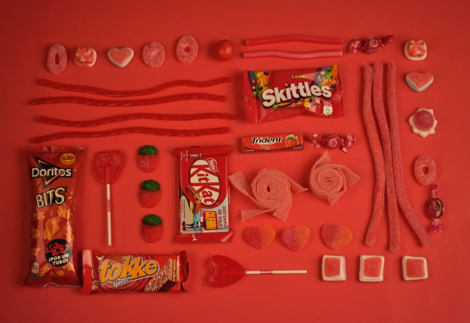
Color Red
Red is the warmest and most emotional of the hues, evoking both positive and negative feelings. It’s linked to feelings of passion, physical warmth, love, rage, and danger. It can raise a person’s heart rate and get them thrilled.
Color Orange
The orange color gives you a boost of energy and happiness. It is aggressive but balanced; it exudes energy while welcoming and friendly. Orange is an excellent color scheme for a product purchase or interacting with call-to-action buttons.
Color Yellow
Yellow, a warm color, is perhaps the most stimulating of the lot. It is associated with enthusiasm, laughter, and brightness. Yellow accents give your design a boost of vitality and make the observer feel excited and cheerful.
Color Green
The cool color green represents new beginnings, health, and riches. Green is the most relaxing color and should be used to establish balance in a design. This is a beautiful color to utilize if a corporation wishes to portray progress, security, or encourage possibility.
Color Blue
Blue elicits sentiments of security and trust and feelings of serenity and spirituality. In addition, dark and blue colors work well in corporate designs because they serve to create a professional atmosphere.
Color Purple
Purple can make a design look more opulent and wealthy, or a lighter purple might convey romance and intrigue.
Color Pink
The pink color associates closely with femininity and romance and sensitivity and gentleness. So it’s naturally lovely, cute, and endearing.
Color Brown
Brown establishes a homely environment. It’s inviting and welcoming, practical and dependable, and can also connote the traditional and well-established.
Color Black
Black conjures up images of strength, wealth, and elegance, but it may also conjure up images of professionalism, neutrality, and simplicity. Dark colors are brash and forceful, and it’s frequently employed to build up a sense of mystery.
Color White
White is associated with minimalism and simplicity. A minimalist style is achieved by using a lot of white in design, resulting in a basic, fresh, and clean look.
Color Gray
Gray is a more mature, responsible color. It’s subdued and reserved, oftentimes feeling secured.
Takeaway: Color Psychology makes a difference
In the end, there are no hard and fast rules when it comes to selecting colors for your brand. While it would be ideal to look at a guide on the internet and simply make the appropriate decision, the fact is that the answer to the question “What color schemes are right for my brand?” is far more complicated. It always depends on your company.
One thing is sure: There’s a color, tint, shade, or tone to match every taste, style, and emotion. Therefore, it’s critical to evaluate the setting in which you’ll be operating. What counts is the sensation, atmosphere, and picture that your brand or product evokes.
But the good news is that studying the potential of color psychology can assist you in making the best decision possible.
When you’ve used color psychology to develop your brand goals, the next step is to turn your files into printed materials that will help you start marketing your company. That’s where we come in.
Davant Indy specializes in printed signage, mailers, flyers, and promotional products: anything you need to develop your brand’s identity. You can either upload your files online or give us a call at (317) 849-6565.