As any marketer knows, the perfect call-to-action (CTA) often makes or breaks a marketing campaign. Although there are many elements in an effective campaign, the CTA directly impacts conversion rates. So, to improve your call-to-action game, gaining some inspiration from those who found success in their own witty CTAs is a wise choice.
With US social media ad spending expected to reach $63 billion by the end of 2022, it shows that marketers fork over a lot of cash for ads. With that much at stake, you are far from the only person getting stuck on ideas when choosing a winning action point for your ads and marketing materials. Luckily, we at Davant Indy are here to offer 10 examples of effective CTAs to inspire you. Using these examples as a guideline, you can craft the perfect conclusion that pulls your audience in and gets them to click, buy, and interact with your content. Let’s get started!
What is a Call to Action?
Before we take a look at some of the best examples of effective calls to action from the last couple of years, it’s important that you have an idea of what a call to action entails. Put simply, a call to action (CTA) is the essential element of an advertisement, webpage, or piece of content that encourages an audience to do something. In the marketing world, CTAs are responsible for helping a business convert its audience to a lead. Depending on the overall goal of the content, CTAs can drive a number of actions, including clicks, signups, sales, and more.
10 Best Examples of Effective Calls to Action
Now that you know what a CTA is and how it works to engage and persuade your audience, you’re likely wondering how to create your own. Sometimes, the best way to inform yourself of the best practices of a compelling CTA is to look at examples of ones that have found success in the past.
1. Spotify
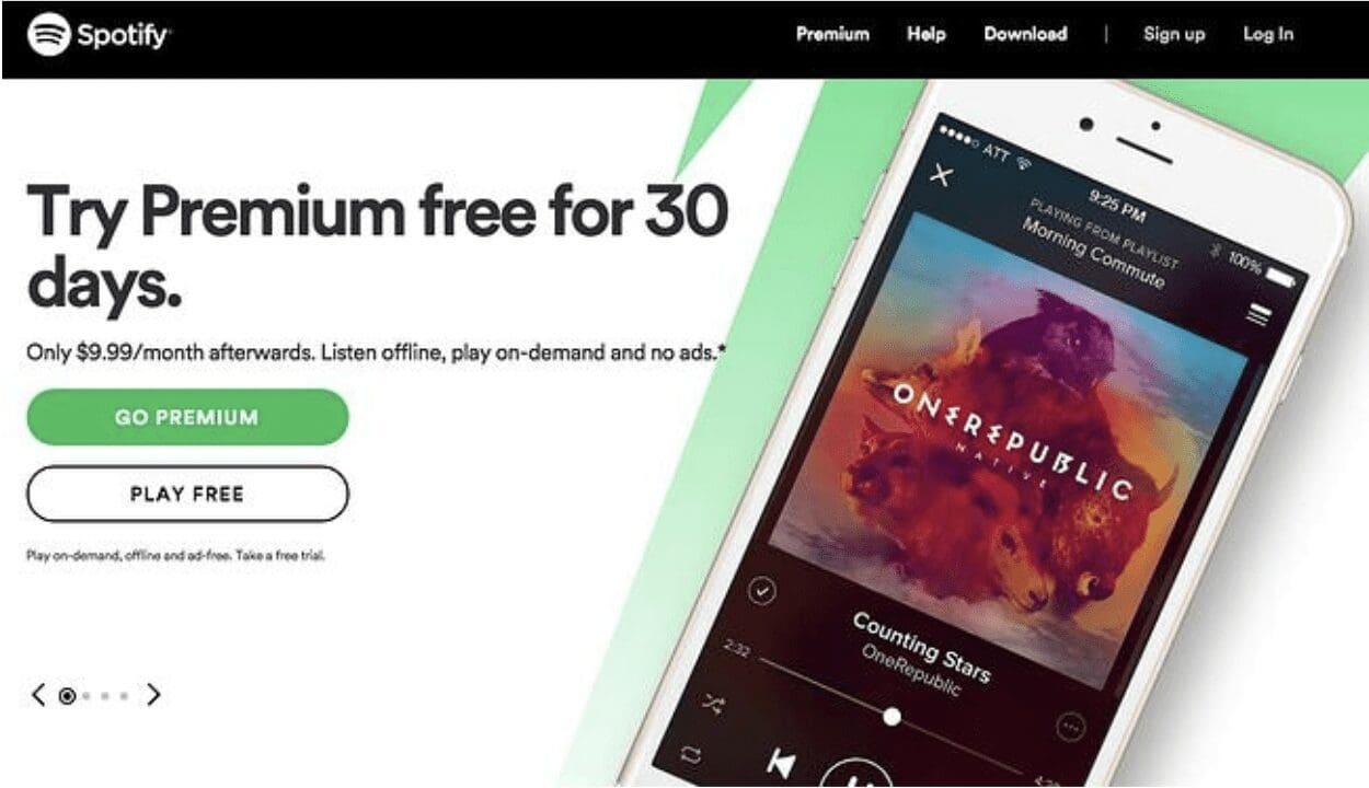 Once you reach Spotify’s homepage, it becomes immediately apparent that its goal is to attract customers who realize the benefit of paying for a premium account. The CTA for members to sign up for a free account, however, is pretty much secondary.
There are a few reasons you can make this assumption easily. For one, the coloring of their CTA buttons is strategic. The coloring of the “Go Premium” button is an appealing and attractive lime green that demands attention. The “Play Free” button, on the other hand, blends in with the rest of the copy on the page. This decision in coloring ensures that customers have to notice the “Go Premium” button first, drawing them to the company’s intended action for customers to take.
2. Uber
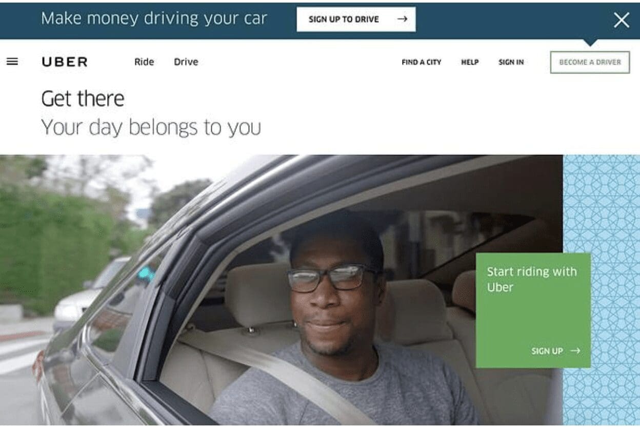 As a company model, Uber is set to attract two distinct types of people to their website: riders and drivers. While these two types of people are entirely different, Uber has gone a long way in tying them together on their website through the use of a large background video that shows both riders and drivers alike enjoying beautiful locations across the world. Further, the copy used on this webpage certainly grabs the attention of its intended targets. The simple yet alluring “Make money driving your car” is straightforward yet powerful. Uber’s webpage and call to action show that sometimes the simplest approach can be the most engaging.
3. ClickUp
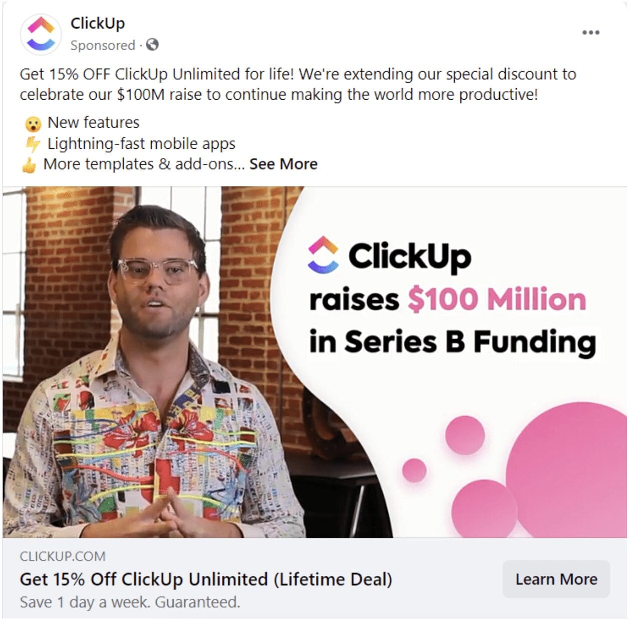 Now, let’s take a look at an effective call to action used in a Facebook advertisement. Likely part of a retargeting campaign, this advertisement from ClickUp masterfully uses an engaging video and strategic copy to demand the attention of those who view the ad.
There are a few different reasons that this advertisement includes an effective CTA. For one, the offer (“Get 15% off) is made very clear as it is used in both the headline and the first sentence of the ad copy itself. Secondly, the “Learn More” call to action button ensures that the audience will have the opportunity to gain more information before committing. Finally, there is expert usage of objection-handling statements in the ad copy, such as “guaranteed” and “save 1 day a week,” which supports the CTA.
4. Shaw Academy
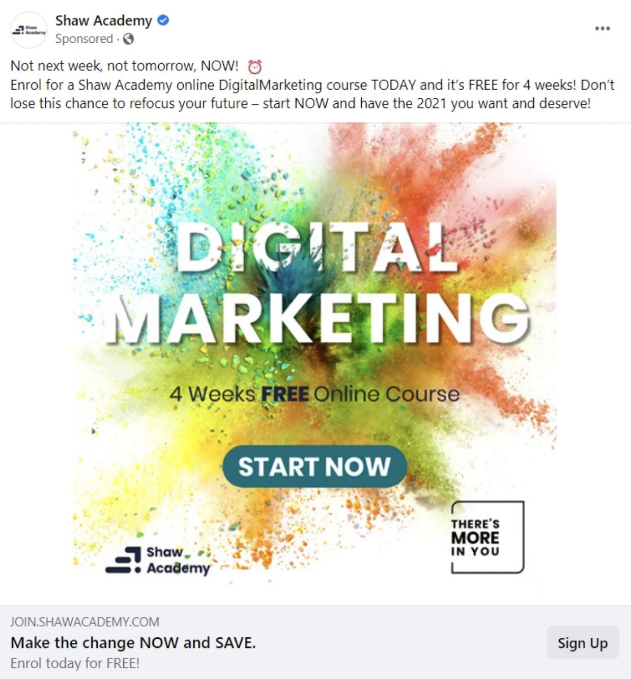 This effective advertisement from Shaw Academy uses several calls to action throughout to instill a sense of urgency in those that view the ad. Not only are there multiple effective CTAs used throughout the ad, but the company was also wise in the usage of many exclamation points, exploding colors, and even an alarm clock emoji to get the audience to feel that they simply must act now.
5. HootSuite
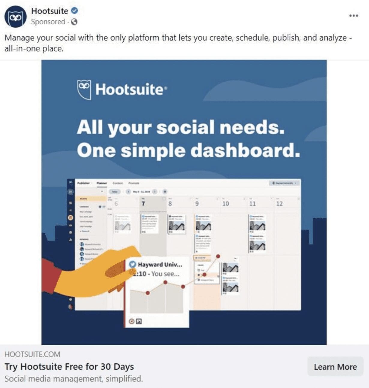 While the last CTA advertisement we looked at used bright contrasting colors to create a sense of urgency, this advertisement from Hootsuite takes a simpler yet equally effective approach. While Shaw Academy made the choice to include several CTAs throughout, Hootsuite uses brief and concise targeted CTAs in their ad. In this example, all CTAs are focused at the bottom of the post, while the benefits of taking the company’s desired action are explained at the top. Further, the CTA button “Learn More” encourages customers to learn more about the offer before committing, creating a sense of trust in the company.
6. Headspace
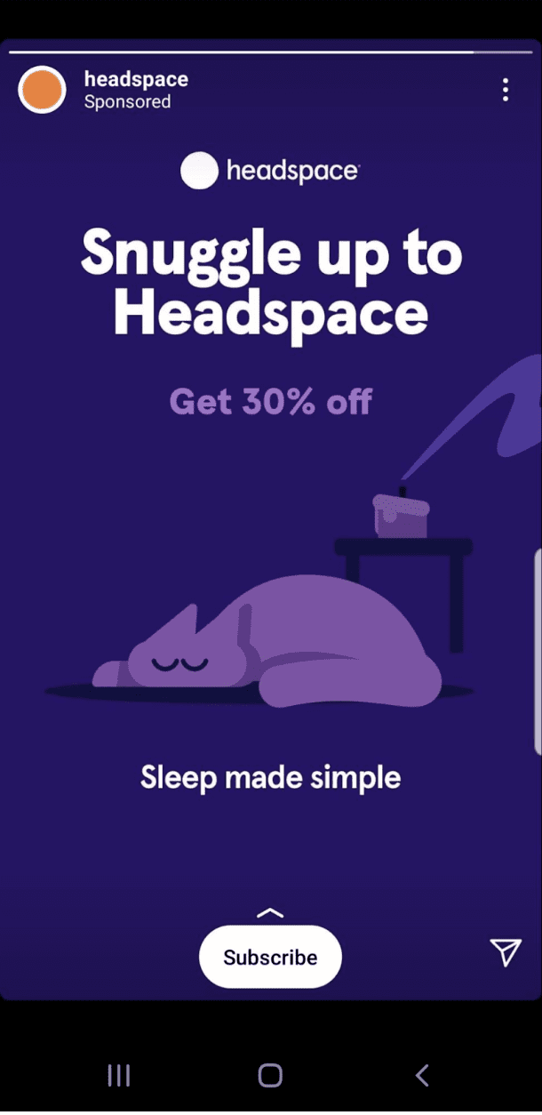 Headspace is clearly a company that knows what it has to offer its customers. In this example of an effective call to action, Headspace capitalizes on their brand as a company that can help you relax and enjoy better quality of sleep by using the custom-made call to action “Snuggle up to Headspace.” This CTA elicits cozy feelings in customers all while personalizing the brand. Sensory words are a great idea in CTAs to drive your audience to your desired action and Headspace uses this strategy perfectly in this Instagram ad.
7. Netflix
 Oftentimes, companies that offer a paid subscription have a difficult time alleviating their audience’s fears of a frustrating experience canceling if they end up not liking the experience. In this smart usage of an effective CTA, Netflix nips this in the bud from the offset. With “Cancel anytime” and “Join Free for a Month” encapsulated in a bright red button, Netflix offers reassurance that caused signups to skyrocket.
8. Prezi
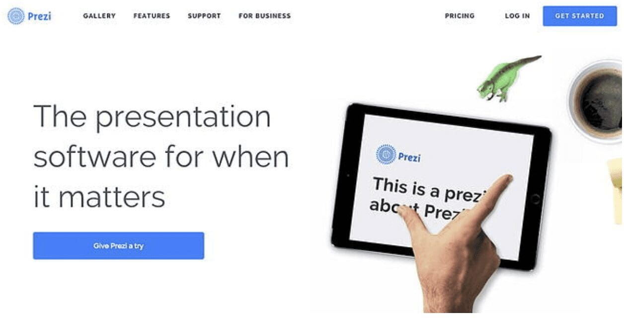 Similar to the advertisement we looked at from HootSuite, this webpage from Prezi includes a minimalist design. Other than the slight pops of color introduced by the cup of coffee and green dinosaur, this webpage is largely devoid of color- except for where it truly matters: the bright blue CTA button that matches the coloring of their logo. On this well-designed webpage, both the blue “Give Prezi a try” CTA button and the secondary “Get Started” button takes users to the same pricing page.
9. QuickSprout
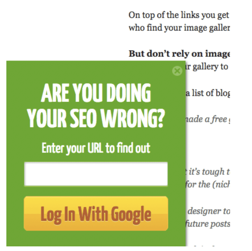 A click-worthy CTA is the name of the game, and in this example of a slide-in CTA on their blog, QuickSprout asks readers a question that really gets them thinking: “Are you doing your SEO wrong?” With the introduction of this question, the wheels immediately begin turning in the minds of QuickSprout’s audience. What’s more, QuickSprout promises to make it easy to find out. All users have to do is enter their URL to find out. This seems very simple and straightforward, driving users to click.
10. OKCupid
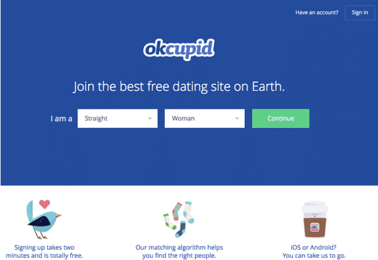 Finally, the CTA used on this webpage from OkCupid may not seem especially exciting or engaging at first glance. However, the genius of this effective call to action is actually found in the smaller details.
Firstly, the call to action on this webpage, “Continue,” is a bright green color that stands out on the dark blue background in an appealing way that draws the eye. Secondly, the choice to use such a simple term in the CTA creates the impression in users that the signup process will be equally as simple. Rather than making users feel like they’re about to have to undergo the frustrating process of having to fill out a boring form, this smart copy makes the entire process seem fun and exciting, persuading visitors to click.
Effective Marketing Strategies From the Experts of Design
Now that you have 10 examples of effective calls to action to use to engage your audience with your offers and content, it’s time to work with experts that can help you design the marketing materials you need to win customers over.
At Davant Indy, design is what we do. Much like an effective call to action, the perfect design is key. We operate under the belief that for your marketing campaign to be effective, it needs to keep the attention of your audience and influence action- much like a masterfully crafted call to action. Trust no less than the best! Contact us today and check out our services to learn more about what we can do for you.
Photo by Jakob Owens on Unsplash